

Podcast: Play in new window | Download
The periodic table of investments is a quick view of how varying asset classes performed year-over-year. Started by the Callan Institute, back in the late 90's the periodic table method of comparing asset classes gained wide expectance as a key way to visualize how various asset classes rank against one another. Additionally, several asset managers/mutual fund companies use the periodic table form factor to place their asset allocations among asset classes to who how they faired against broader indices.
You likely ran across investment literature that used the periodic table at one time or another. For those unfamiliar with the table, here's an example from Callan, the company that pioneered the concept:
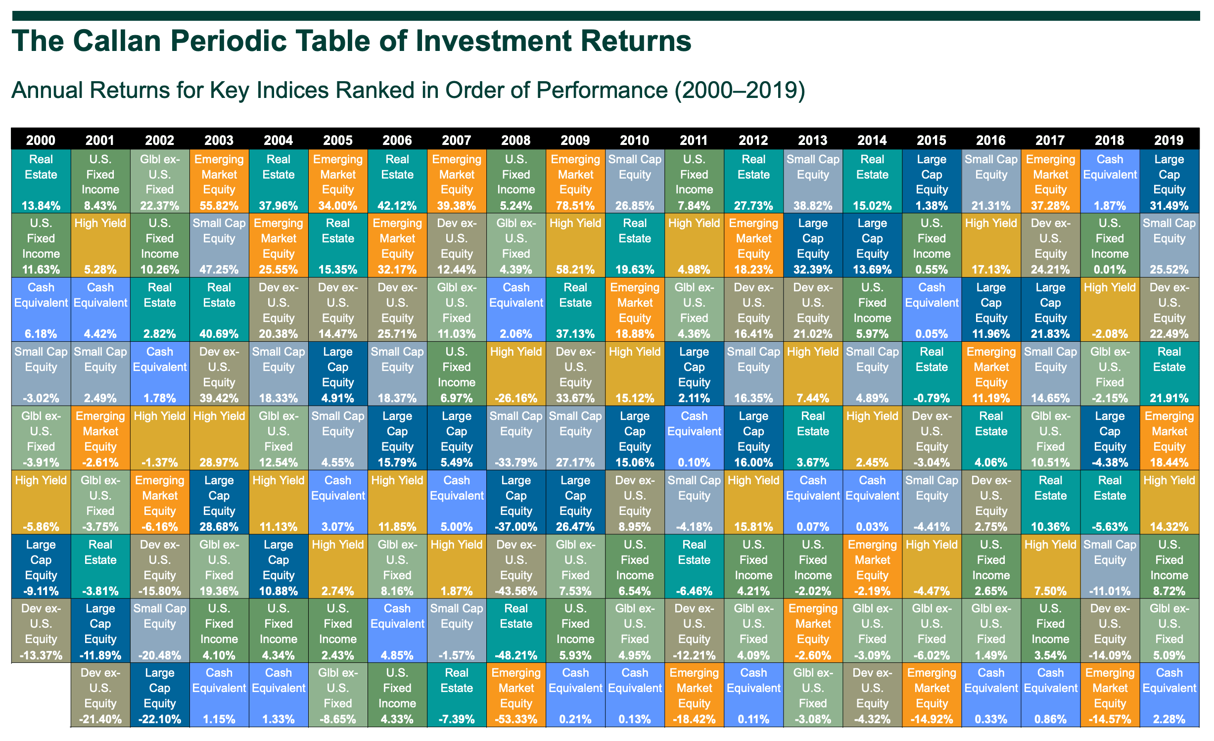
The table shows us how several asset classes performed each year for 20 years. The best performing asset classes appear at the top of the column in each year while the worst performing asset classes appear at the bottom. Looking at the table, we think we can make a couple of key observations:
- Several asset classes experience pretty extreme volatility from year to year. This appears especially true for Emerging Markets and Developing Equity.
- Lower risk asset classes tend to be less volatile, and their movement from top to bottom of the annual column comes more from extreme movements in riskier assets
- Despite its relative risk and volatility, Large Cap U.S. stocks remain rather stable with respect to their positioning/ranking within the various asset class options.
But from experience, I know that what I think I understand from quick observation can be incorrect. So to help understand the volatility of these asset classes, I put together a rank order of their standard deviations. Doing that, we get the following result:
| Asset Class | Standard Deviation |
| Real Estate | 21.70% |
| Developing Equity | 21.18% |
| Small Cap Equity | 19.83% |
| Large Cap Equity | 18.07% |
| High Yield | 16.28% |
| Global Fixed Income | 8.26% |
| US Fixed Income | 3.43% |
| Cash | 1.88% |
Looking at it this way, we see that real estate ends up being the most volatile. Despite Large Cap Equities' usual middle of the road ranking year over year that doesn't stray too far from its previous year ranking in most cases, it still ends up varying much more like its riskier counterparts than its lower risk alternative classes.
I do want to note that I dropped Emerging Markets from this analysis because I only had 19 years of observations. While one might argue that this one fewer observation probably doesn't change the results by much, it's still an example of bad data control and an unfair comparison.
How do Historical Asset Class Returns Compare to Whole Life Insurance?
Using the data from the periodic table of investment returns, we can calculate an effective compound annual growth rate for a hypothetical investment in the various classes. We simply use the annualized return and plug it in as a value for an assumed investments rate of return, calculate the ending balance of whatever systematic investment we wish to assume, and then calculate the resulting geometric rate of return. If you'd like a step by step guide on doing this, you can find on in Predictable Profits.
We can use the values derived for each asset class and compare them to what we know whole life insurance achieved over the past 20 years. Here's how this breaks down:
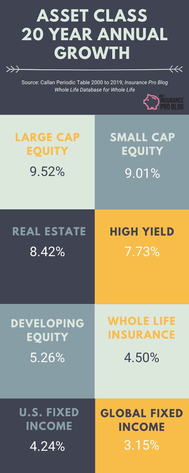 There isn't a whole lot of surprise here. Equities remain on top while fixed income rounds out the bottom. Whole life insurance is a fixed income asset, so it falls within that category and doesn't rival equities in terms of gross rate of return.
Again, I dropped Emerging Markets from the analysis because I don't have a full 20 years of observations. Also, I removed cash from the above ranking because my chosen formatting needed an even number of asset classes. For those interested, cash came in last place at an effective CAGR of 1.31%.
There are some key observations that I do think are well worth noting.
Periodic Table of Investment Returns with Whole Life Insurance Observations
First, despite its high volatility, Real Estate places third on the list. As an asset class, it's somewhat difficult to get on board (in my mind) knowing that it's more volatile than both Small and Large Cap U.S. Equities, and performed pretty significantly worse over the last 20 years.
Second, the old sentiment about High Yield Bonds appears corroborated by this data; the category functions much more like equities than it does debt/fixed income securities. Its volatility is considerably higher than other fixed income assets, but it does achieve a higher return in this analysis by a pretty wide margin. Still, it's difficult to justify it given the return and volatility profile of Large Cap Equities.
Whole Life Insurance performs very close to U.S. Fixed Income. We anticipated this. But notice that it performed the best among all the fixed income options (ignoring high yield since high yield works differently than traditional fixed income investing). Keep in mind that as a fixed income-like asset whole life insurance offers superlative principal safety as well as liquidity.
Calculating the standard deviation of whole life returns to compare to the table above is a little tricky because I don't have the same granular data I used in the periodic table. But from previous analyses we performed on this subject, we know that whole life insurance dividend variation (the only component that drives variation) is extremely low. Less than 1% low, which places whole life insurance in a volatility category below cash and cash equivalents.
None of these calculated returns factor in investment management fees (unlikely to make any substantial difference in the results) or taxes (potentially likely to make a moderate change to the results).
Whole life insurance is a low risk asset and it achieves returns commensurate with its overall risk profile. It actually achieves returns that are quite good keeping its risk profile in mind. This doesn't make it the best asset available. Nor does it make it the only asset you should ever own. But it does certainly deserve consideration when building a well rounded portfolio. It can complement more aggressive asset options to help cushion volatile markets. Ultimately, it's an asset class with a strong and incredibly stable rate of return.
I’m sympathetic, but where did you get the return for whole life? Isn’t whole life a bit of a bear to figure out the true “return” since the investment gets expenses taken out off the top, then the dividend includes a return of those expenses for favorable actual experience? I don’t think I would include that return of expenses in the true investment return of whole life.
Hi Jared,
The return for whole life comes from out compiled database of whole life returns using real historical data from numerous sources including some of our own private examples. It’s a net IRR figure and an average of all those results. Some did better; some did worse. So we’re taking the premiums paid, and the cash value at year 20 and solving for RATE in a standard TVM calculation when the premiums payments remained constant in all years. When the premiums varied, we’re solving an IRR calculation to arrive at the rate of return.