

About two years ago, we put out an article with real historical results of a blended whole life policy. The policy was shared on the Bogleheads forum (of all places). The compound annual growth rates of that policy and the S&P 500 were close.
But, I made a mistake in my comparison…
Systematic Investing, I Violated my own Rule
People tend to confuse the results of systematic investing and lump sum investing. Lump sum investing results report a higher effective compound annual growth rate. That is why people love to use them. But, most people don’t actually save their money this way.
Two years ago, I took the lump sum investment results from the S&P 500. I compared them to the systematic saving results of the blended whole life policy. This time we’ll compare systematic to systematic.
But, there’s something else that always bothered me about this comparison.
You can’t Invest Directly in the S&P 500
You could try to buy shares in public companies that currently make up the S&P 500. But, as the index is ever-changing, you’d have a heck of a time keeping up. Keep in mind that the index can also swap bad performers for good ones. It does so without selling and buying a new security. For this reason, index funds all tend to lag the actual S&P 500 performance.
What if we used historical results of an S&P 500 index fund instead for this comparison? What index fund should we use? Well, this little gem of historical validation came from the Bogleheads…
Why not use their favorite fund company?
VFINX vs. Blended Whole Life Insurance
I calculated returns from Vanguard’s S&P 500 index fund (VFINX) using data from Yahoo Finance. Ignoring fund expenses, the effective compound annual growth rate from 1992 to 2009 is 2.78% (which is the original time frame quoted by the policyholder).
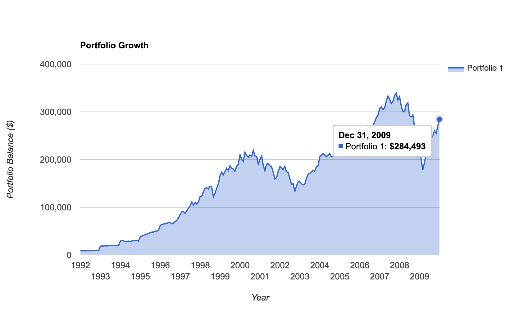
NOTE: A reader noted that backtesting the VFINX through the Portfolio Visualizer produces a different result than I originally calculated here. My own use of the Visualizer confirms there is a discrepancy. I can't find the original calculations that went into producing this chart, but the Visualizer computes the VFINX's balance at 2009 at around $280,000 not the ~$215,000 the original chart shows. That changes the compound annual return to 5.71%. Please see Jared Haines' comments below. And here is a chart showing the Visualizer's results for the VFINX:
This chart compares the VFINX’s historical performance to the blended whole life policy:
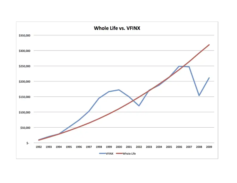
As you can see, the VFINX was doing awesome from the mid to late ‘90s. In the early '00s, it sunk to performance levels below the whole life policy.
The VFINX fought back. It managed to match the whole life policy’s performance for a while. But, the “Great Recession” did its deed on the stock market. The fund’s performance dropped way below the whole life policy.
2009 to 2014
“What about the years following 2009? Most of them were great!” I hear you say.
It's easy to calculate the VFINX results. But, I don’t have any further exact data on the blended whole life policy. Although, I can make an extrapolation based on the data that we do have.
We can estimate the growth of the blended whole life policy. It is possible using statistical regression on its past performance. This approach isn’t perfect. But, it’s the best guess we’re ever going to have at our disposal.
Here are the results:
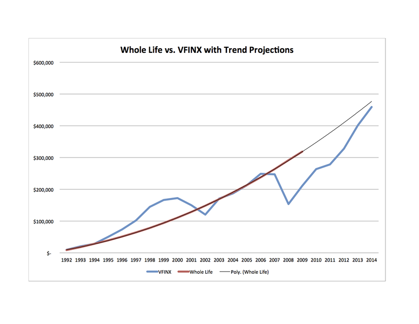
The regression line “fits” our whole life curve well. That’s a promising sign for those of us who care about accuracy. The graph shows the VFINX still hasn’t caught up to the blended whole life policy. The effective compound annual growth rate of the VFINX by the end of 2014 is 5.66%.
Before you shake your head and think “pathetic,” there's something you should know. That 5.66% annual return is almost 13% better than the actual average annual return achieved by investors.
It’s possible to beat whole life insurance cash value performance by investing in U.S. equities. But, according to the statistics, not many have. And let's not forget that we're talking the actual performance of one of the most well-regarded index funds.
Historically speaking, the volatility is definitely higher. But, higher returns didn’t materialize.
“Before you shake your head and think “pathetic,” there’s something you should know. That 5.66% annual return is almost 13% better than the actual average annual return achieved by investors.
It’s possible to beat whole life insurance cash value performance by investing in U.S. equities. But, according to the statistics, not many have. ”
Great point Brandon, there can be (and often is) a big difference between investments and investor [behavior]. Looking at the different investor bias, it’s not hard to believe that blended whole life will outperform the market [investor].
Hi Guys
I work here in New Haven CT with many clients who fit your average client profile in terms of net worth and income. Many of these clients want to invest ‘the way Yale’ invests and few want to discuss risk and human behavior the way Yale Professor Shiller does; so these Life v VFINX charts are a terrific visual to work with clients to frame several key aspects of the conversation: Value, Risk, Timing of withdrawals.
Thank you for the data and the willingness to dive into the math. As an agent/advisor who returns to your work and Nassim Taleb almost exclusively I’m wondering if you’ve done a post discussing properly designed Cash Life and its value for Black Swan like events?
I saw a headline of excitement the other day about the Nikkei’s 20 year high and thought, ‘yeah, but, if I was all in back in ’89 I couldn’t retire today’ Wondering if you’ve looked at how a properly designed IUL tied to the Nikkei might have done over that time? Clearly your 1992 policy is a runaway hero. In either case proper Cash Life is a tremendous hedge with significantly less risk.
Thank you again
“You could try to buy shares in public companies that currently make up the S&P 500. But, as the index is ever-changing, you’d have a heck of a time keeping up. Keep in mind that the index can also swap bad performers for good ones. It does so without selling and buying a new security. For this reason, index funds all tend to lag the actual S&P 500 performance.
What if we used historical results of an S&P 500 index fund instead for this comparison? What index fund should we use? Well, this little gem of historical validation came from the Bogleheads…
Why not use their favorite fund company?”
This is not accurate. The tracking error of VFINX over the last decade has been 12bps. If you include the taxes on dividends and the tracking error and fees the fund lagged the index by 39bps. The CAGR of VFINX from 1992-2009 was 7.66% net of fees but before taxes, which are only on the dividends and capital gains which that fund rarely distributes. Obviously your scenario is an annual investment of $8951 which does perform better in the life policy than the index fund. I am not arguing with that, but you should correct the data on VFINX.
Hi Adam,
Perhaps you quoted the wrong part, but I’m having a hard time piecing together what you are taking issue with, what you quoted, and how what you left as a comment all come together. Any additional help is appreciated and we’ll be more than happy to look at it and correct if necessary.
Thanks!
Where are you getting this data for VFINX? Both portfoliovisualizer.com and Yahoo! Finance show much better performance than 2.55%.
I’m not sure what 2.55% is in reference to.
Not sure either. I think it’s a typo. When I use portfoliovisualizer for VFINX from 1992 to 2009, the CAGR was 7.65% and even removing dividend reinvestment, it was 5.48%. This article has 2.78%.
For 1992 to 2014, the CAGR was 9.27% and the price return was 7.09% annually. The article quotes 5.66%.
So I’m asking how the returns were calculated.
Hi Jared,
Thanks for the follow up and apologies for the long delay in my speaking to this. I needed some time to go back to this post and remember how it came together. Plugging the values from original post into the Portfolio Visualizer I do get a different result from the value calculated back when I originally published this blog post, circa 2014. The Visualizer says the VFINX should be at $284,493 calculating internal rate of return on that gives me an IRR of 5.71%.
Because it’s been so long, I have no idea where the original calculations are for this blog post, but looking at the chart, it appears the VFINX balance I calculated at the end of 2009 was somewhere in the neighborhood of $215,000, which would make that calculation mentioned in the blog post correct. But I cannot verify how I got to that number, so I’m putting a note in the blog post to direct people to this comment.
Thanks again for taking the time to look over this and let us know you think there was an error.