

Investment income is a huge profit driver for life insurance companies.
We've spent a lot of time analyzing and reporting on overall investment yield trends for life insurance companies, but that analysis only compares the raw yield insurers achieve on their managed asset pool. It's possible that a declining yield simple indicates a de-risking strategy.
Investment income is not necessarily declining and the insurer is under no real financial trouble. In fact, we've made this argument several times when discussing these trends and others.
So if we instead look at the absolute amount of investment income and how that has changed over time, do we see any trend that indicates declining overall income? That's the question today's analysis seeks to answer.
Declining Yield, but Increasing Investment Income
Insurance companies have long proven successful at accumulating assets. In fact, total asset growth at most major life insurers remains impressive.
Given this growth in managed assets, there's reason to believe that declining investment yields still net positive investment income growth. In other words, a company that experiences year-over-year decline in net yield on invested assets may not be losing money or as much money as we might assume since they are achieving net gains from a higher basis of which they derive yield.
An example will help ensure understanding.
If I have an asset pool of $100,000,000 and I achieve a 4% net yield on my assets, my net investment income is $4,000,000. If my yield drops to 3.5%, but my asset pool grows to $120,000,000 then my net investment income increases to $4,200,000.
To be clear, this reality isn't necessarily ideal for most insurers. More assets can mean more policyholders, and if this is the case that could mean lower overall benefits (i.e. cash value growth of permanent life insurance policies) for each policyholder.
However, the equation is a tad more complicated than this.
Insurers target profits through various activities based on policy features (i.e. guarantees). These guarantees represent required income the insurer must produce to cover the anticipated expense. Income–regardless of source–that exceeds the target for these features represents cash flow that could go towards augmenting dividends or interest rates on cash value life insurance policies.
2015 Whole Life Net Investment Income Trend Results
Looking at major life insurers in the individual participating whole life insurance marketplace, we've calculated the average annual change in net investment income from years 2010 through 2014 (the most current figures available).
We've opted to calculate the average per year change over this time period rather than simply the compound annual growth rate from 2010 to 2014 because this could significantly understate or overstate the impact of a very bad or good year respectively within this timespan.
The results are in this table (data taken from statutory filings):
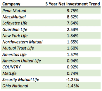
Our Commentary on these Results
The most impressive and interesting result comes from Penn Mutual.
Penn is one of only two companies that achieved a positive trend in terms of investment yield from our comparison published in May of last year. The fact that Penn Mutual tops this list with a nearly double digit growth rate in absolute net investment income for the last five years is very commendable.
The rather large gap between rank position three and four is also intriguing.
MassMutual and Lafayette Life follow Penn Mutual with average annual growth rates of 8.62% and 7.64% respectively, but Guardian Life takes fourth place with only 2.53% average annual growth.
Given Lafayette Life's mediocre placing in our comparison of investment yield trend, we can only infer that the company has achieved much higher than normal asset growth over the same period.
Only two companies show negative average net investment income growth, Security Mutual Life and Ohio National. Both companies were somewhat middle-of-the-pack performers in our investment yield trend analysis, so it's likely that both are experiencing trouble with declining yields that push total investment income below prior years.
The average growth rate among the entire group is 2.70% and the median is 1.60%.
As we've explicitly mentioned in past comparisons, this is but one metric in a sea of many. While we will always argue quite strongly that investment income metrics are among some of the most important, there are other attributes to review before making any definitely decision about a life insurer–especially when evaluating one for the intentional accumulation of cash value.
Are you concerned about how PML has been obtaining higher returns and recent projections are very generous? I spoke with a retired actuary who evaluates life insurance policies for consumers and he indicated that PML never used to be competitive and came out of nowhere, raising some flags in his mind. Thanks.
Hi Cary,
Your question suggests I’m making some sort of recommendation concerning Penn Mutual, which is clearly not my intention.
I can’t speak to your actuary’s comment since it would be nearly impossible to truly know the competitive position any carrier had at anytime in the past since policy performance is dependent on how the policy is structured and implemented and macro data about insurer “competitiveness” has always been about how a one-size-fits-all hypothetical policy performed based–sadly–on whatever data the insurer cared to share.
As far as projections today go. Keep in mind that all projections must be certified by the actuary department and approved by state regulators based on company specific details (if sufficient experience exists with the product) or based on NAIC allowable assumptions (taken from either CSO or VBT). I’m not aware of any insurer on this list that is not permitted to use company specific data, but it should be well understood that projections are not simply a matter of what an insurer feels like publishing nor can it simply be based on a current dividend rate that happens to be good. The disciplined current scale requires several historical data points and can bring future projections down as a result. This was the core argument made by more whole life focused insurers against indexed universal life insurance since IUL could simply be projected at a seemingly arbitrary rate without consideration of how the company arrived at that rate and without adjustments for prior actual lower performance.
If you leave out 2014, Penn Mutual’s net investment trend is also negative, so despite avoiding CAGRs, this result is highly dependent upon a single year due to the large relative increase. Love your work, but would be helpful if the data behind these types of analytics were made available.
Hi Chris,
Penn Mutual’s net investment income for the periods we used is as follow (values in thousands):
2010 – $419,024
2011 – $491,001
2012 – $525,544
2013 – $578,626
2014 – $605,774
Your statement that omitting 2014 results in a negative result is clearly false as their income trend has been upward for all years. In addition, calculating average year over year change is done precisely to lessen the overstatement of an abnormally good year as you’ve suggested could happen.
This data comes from statutory filings data that is widely available to anyone.
Thanks Brandon. I was looking at VitalSigns data which is also pulled from statutory filings, and I was using annual total investment return as the metric, so I can see where it may differ. It may be that we need to use the ‘Net Yield on Mean Invested Assets’ as the metric rather than total investment return (since this would include marking to market certain investment to include unrealized gains/losses). According to VitalSigns, the net yields for Penn Mutual were:
2010: 5.18%
2011: 5.46%
2012: 5.34%
2013: 5.53%
2014: 5.40%
Total Investment Return figures are:
2010: 5.04%
2011: 5.50%
2012: 4.58%
2013: 4.96%
2014: 7.38% (which is where my comment came from)
If we use the net yield instead of total return however, and we back out the asset base generating those returns by using your investment income dollar data, we’d get (and I realize this is not a perfect way to do this, but we’re concerned with relative performance, not absolute):
Return-generating Asset Base:
2010: $8,089,266
2011: $8,992,692 YoY Asset Growth: 11.2%
2012: $8,841,648 YoY Asset Growth: -1.7%
2013: $10,463,400 YoY Asset Growth: 18.3%
2014: $11,218,037 YoY Asset Growth: 7.2%
Now, VitalSigns reports that Penn’s 3-year compound asset growth was 9.8%, and based on my data listed and your investment income data, our 3-year compound asset growth was 7.6%.
My question is this: where is the logic faulty? The 2014 data says Penn’s total invested assets total $9,409,757, so even if all of it is income producing (which it presumably isn’t), where can one obtain an accurate assumed yield in 2014 that represents that 605,774/9,409,757 = 6.438%? Perhaps the optimal way to look and tie this together (and correct me if I’m wrong please as I’d like to learn), is to indeed use the total investment return in 2014 of 7.38%, where 605,774/0.0738 = 8,208,320 as an income producing asset base? This seems more likely, given the total invested assets are 9,409,757, so our sub-asset income-producing base represents approximately 87% of the total. This would make sense when we know that 80% of invested assets are in bonds, 6% in stocks (divi paying probably), and 0.3% in mortgages (=86.3% of total).
Long winded I know (apologies), but curious to hear your thoughts whether one can tie the various elements together this way as I don’t see the dollar income on the VitalSigns reports I read.
Thanks, and keep educating!
Chris
Hi Chris,
I could be wrong, and correct me if I am, but I think the main reason you are coming to a different yield is a result of excluding PIA from the asset pool. When we look at these numbers, we combine major subsidiaries. For example, New York Life numbers include both NYL and NYLIAC, Guardian numbers include GLIC, GIAC, and BLICOA, etc. Penn would include both PML and PIA so the asset base is slightly higher than you are assuming if looking at PML alone.
Thank you for your response. I did not intend to imply you were recommending PML. I actually tend to like PML, but continue to do due diligence.
I suppose my question really concerned some of the questionable reinsurance practices that are slowly coming to light with some insurers. To be fair, I haven’t seen any industry commentary about captive reinsurance (shadow insurance) issues with the mutual companies, but it is still best to be ever vigilant.
Thanks again.
Are you at all concerned by declining yields? In your example above, yield income increased but if policy sales increase, that becomes a moot point as they have to pay out more interest to new policies as you implied.
At some point, asset base becomes irrelevant under a ZIRP. They can’t generate sufficient yield in such an environment without taking on additional risk.
Where do you see yields going from here and why?
Hi David,
Yield will continue to be strained until we have a macro interest rate increasing environment. The biggest variable affecting insurers moving forward is the mean duration of their bond book. For the most part those with longer maturities will tend to be better off, but there is nuance. If an insurer chose to acquire newly issued 20 year notes recently, for example, it would suggest they are better off than they likely are. I would note, however, that I seriously doubt any insurers are doing this right now.
Instead they are, as you noted, taking on more risk and moving more assets in Schedule BA assets. This isn’t great news, but there are a number of insurers who can handle the additional risk at least for now.
We track interest margin quite a bit and place a pretty large emphasis on it when evaluating insurers, since we believe we can infer overall “health” in terms of income produced beyond obligations. Most insurers have remained pretty consistent with this, but some have experienced significant swings in recent years.