We've heard a lot recently about the fiscal cliff and the second dip, so recently I decided to spend a weekend reviewing stock market charts. Some of you might remember this guy from last year. Consider this part two.
Round Two: The S&P 500
Last time I looked at a historical chart of the Dow Jones Industrial Average and pointed out that the growth pattern that has fueled a lot of the stock market sales literature came at the introduction of an incredible shift not only in new technologies, but also the reformation of American savings/retirement vehicles.
Last time it was a simple function of a rightward shift in the demand curve, and this time it's really no different. Only with the S&P we don't have as many historical years as the current index–the S&P 500–hasn't been around as long. But here it is:
All right, so I've added some colorful commentary into which we'll drill deeper.
Personal Computers, IRA's, and 401k's: New Year Same Story
Last time I pointed out that prior to the introduction of IRA's, the 401k Plan, and the first “Mass Marketed” personal computer (which can be thought of as the inception of the tech boom), the stock market was sort of a mixed bag. And the S&P chart doesn't disagree. From 1972 to 1982 the Compound Annual Growth Rate (CAGR) for the S&P 500 was roughly 2.77%. That's a far cry from 8%.
Value = Scarcity
The most troubling depiction coming out of this graph is where the S&P currently sits. Remember, I'm a big believer in averages and the tendency for things to localize around a mean. I've stated before, and I'm holding onto the belief that there's nothing currently going on in our economy that would lend credit to the notion that the stock market can push through its current performance and give way to a growth result akin to what we witnessed through the late 80's and throughout the 90's.
In fact, I've been quite vocal in several venues about my belief that stocks will continue to be heavily substituted with bonds as our big population lump (the baby-boomers) move into retirement and do what retired citizens tend to do–buy bonds. Again, we need no more sophisticated analyzing skills than to understand the simple principals behind supply and demand. If people buy fewer stocks, prices will not appreciate. The only thing that makes something valuable is people's desire to have it. If fewer than 25% of “accumulating” investors are somewhat to very comfortable with market volatility, I don't see the demand for stocks pushing prices to new highs anytime in the near future.
But let's look closer at the chart.
One, Two, Three?
Notice our chart is nearing a level that would put it on par roughly with the apex the S&P has reached not once, but twice before. That observation alone ought to drive some to wonder what might happen in the near future to the S&P 500.
Do we then have reason to believe that another dip in the S&P is on the horizon? I made a few attempts to hazard a guess with the following exercise.
Modeling S&P Performance
To dig a tad deeper I ran a regression model on monthly closing data of the S&P from 1982 to 2012 and then another from 2002 to 2012. As a really quick primer with no mathematical mumbo-jumbo, data sets have averages. We can look at data sets, observe their trends, and make inferences about how those trends will play out in the future by merely using the average change in a dependent variable with respect to an independent variable.
To do this with S&P data we merely take historical closing data and regress the close against time. Doing this will generate an average S&P close against which we can compare the current close of the S&P 500 (think scatter plots and the Line of Best Fit from grade school).
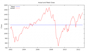
Doing this yields the following result:

The blue line represents the “fitted” or “predicted” value while the red line shows us where the actual results land. One thing that should immediately stand out is the intuitive trend that as the S&P grew to close at levels well in access or in deficit of the fitted average, we see a strong resurgence heading towards the average. In statistics, this is a phenomenon known as “regression towards the mean” and it's a fundamental notion behind regression analysis.
If we take the data points back further, we'd see prior to 2002 our actual results were well above the fitted line value of 1182. I know this because 1.) I actually ran this scenario and 2.) we can easily call up a historical closing table of the S&P and see that from December of 1998 through February of 2001 the S&P never closed below this level at the end of any month (also, if we include this data in the regression, we actually end up with a lower average S&P close).
Note, currently the S&P is at 1440.67 as the close of business on Friday September 28, 2012, or 258.67 points above the fitted mean. Does this mean we're headed back down hill and you should make your exit?
I can't give you blanket investment advice, so please don't act on this information alone, consult an advisor. Further, there are important considerations to the limitations and quality of these results, which I will now detail.
Quality Testing
It should come as no surprise to anyone with even a rudimentary understanding of inferential statistics that this data is heavily autocorrelated, it's time series data. And one of the fundamental assumptions of ordinary least squares (the mathematical engine behind this regression) is that the data be non serially correlated (no autocorrelation). The presence of which, does not bias OLS, but will cause it to under or over estimate predicted values (i.e. create larger or smaller error terms–aka residuals–in our case larger).
For those of you who have no idea what the hell I just said. Here's the consumer friendly version: the amount of difference between what the model predicts the value will be relative to what it actually is forms an S-like pattern around the fitted curve (i.e. the average value), which is normally a bad thing when it comes to regression analysis.
However, back to more technical discussions, since we are using time as our regressor, the presence of serial correlation is of less concern, because we are not trying to segment the impact of some other explanatory variable. Call it cheating if you want to, but the intent here is to take a very broad macro look at the movement in the S&P.
Other assumption tests for results integrity (heteroskedasticity and multi-collinearity) left me with no concerns.
Is a Dip Coming?
At some point, it's inevitable. The magnitude and the exact timing will always be a mystery. The only thing the example above can tell us is that we're likely on borrowed time when it comes to stock market expansion (i.e. it can highlight high level movement, not precise action). If, however we performed this analysis on a single stock, this would be indicative of a sell sign.
The other thing we can take away from the data here is the calculated mean of 1182 has a standard deviation of about 16 points. Meaning anything outside 1149 and 1214 could cause us to anticipate an upward swing if below that range or a downward swing if above.
Is this a call for you to attempt to time the market? No. It's more about managing expectations. If the stock market retracts a little bit in the next year or two, we can't act wholly surprised. We can always hope that some exogenous factor comes into play and carries us on a good ride upwards–I'm not holding my breath. I don't honestly know if the second dip is on its way, but I'm certainly not recommending people begin to dive into the stock market at this moment.

